Twitter is one of the most open social networking platforms out there: You can chat with anyone in real time without being friends with that person.
While being an awesome social media platform, Twitter functionality is not always easy to figure. Many Twitter users are usually confused when it comes to finding replies on Twitter.
Why Can’t I See Comments on Twitter?
You can: You just need to know where to look for them. People tend to click “Comment” icon for each individual tweet to see replies but it opens a dialog to post a comment instead:

How to View Comments on Twitter?
Time needed: 5 minutes
- Step 1: Click on the timestamp showing when the tweet was published
When viewing Twitter timeline or anyone’s Twitter profile, click on the timestamp* showing when the tweet was published

- Step 2: Scroll to the very bottom to see Twitter replies to that tweet

*Alternatively, you can click on the tweet itself and it will open up in the overlay. Just be careful not to click on a hashtag or a link inside the tweet (which will open hashtag search results or the linked page instead)
The same trick works both on desktop (using any browser) and Twitter mobile app (iPhone or Android). It will also work on third-party social media management apps and Twitter clients like Hootsuite and Tweetdeck.
This will include only direct replies to a Tweet (those that were posted publicly). Do not confuse a reply to a direct message (i.e. DM) which is a private message.
Some people use “Retweet with comment” option to post replies to any tweets.
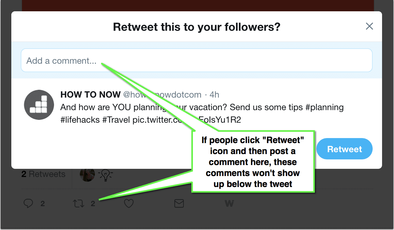
Don’t worry: Those can still be found:
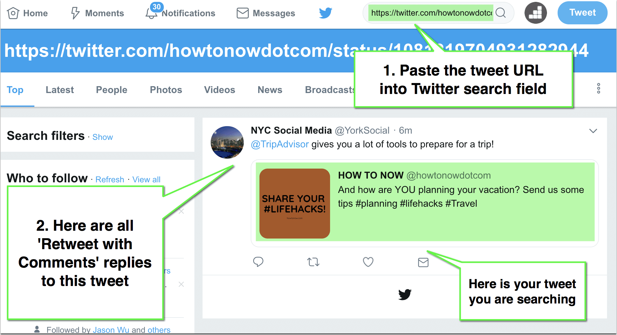
How to Find All “Retweet with Comment” Replies for a Particular Tweet?
- Right click / double-tap on the on the timestamp showing when the tweet was published and select “Copy link Address” (Google Chrome) or “Copy Link Location” (Firefox) or “Copy link” (Safari)
- Paste the URL into Twitter Search field and you will see all the retweets with comment to this particular tweet
How to See Comments on Twitter NOW
Knowing how to see other people’s comments on Twitter may turn useful in many cases, for example:
- Journalistic research: Journalists and writers (bloggers) can find more people to quote and opinions to embed in their articles, especially when it comes to hot trends that are happening now. Twitter conversations always provide fresh insight and angles.
- Anyone can find interesting discussions to join (to participate in a conversation or get more followers)
- Bloggers can find all the discussions around content they publish to engage and interact with their readers (To generate more comments)
- Anyone can find more funny comments on any popular tweets (Think political debates, for example)
- Instant content ideation and inspiration: Writers can find more questions to cover in their articles, or more experts to connect to.
- Anyone can find relevant animated GIFs to download from Twitter
- Anyone can find cool (and more importantly, real) Twitter accounts to follow
And how do you use Twitter? Let’s discuss!
Here’s our video instruction: How To See Comments On Twitter

Leave a Reply